Blog - Web design Leeds, Big Red Circle we do web design and web applications

Posts Tagged ‘usability’

Jolicloud review, a netbook in the sky

Monday, June 8th, 2009

Jolicloud

Jolicloud is a new OS optimised for netbooks and working in the cloud.

What’s a netbook?

Have you seen those little laptops which are too small to do any real work on? Well they are great and actually boost productivity. I have been a big fan of netbooks for a long time. They are often most useful when used with applications that are online and in the cloud. I will apologise now for the overuse of internet buzzwords in the following paragraphs.

And what’s cloud computing?

Cloud computing is a style of computing that is scalable and uses resources provided as a service on the internet. An application that uses cloud computing often requires an internet connection and is accessed though a browser. Google Docs is a good example of an app that uses cloud computing.

So Jolicloud is…

A happy mass of water vapour high in the sky? No, it’s a great new operating system that has been designed especially for netbooks. No stripped down version of XP for them. Jolicloud has been described as “A social Operating system” and “An OS in the cloud” but I think of it as an OS that is “properly” optimised for netbooks.

The Review

get-started-iconJolicloud is in its alpha stage at the moment so there are one or two quirks. This is to be expected so I wont dwell on it too much. What I didn’t expect is that it would look as polished as it does. Small touches which I didn’t expect such as nice graphics on the volume control and brightness indicators. User interface/experience is always about the little things.

I installed it on a Samsung NC10 which has the default Windows XP that came with the netbook. In a matter of seconds, done! No issues at all. I am indeed quite Joli!

Jolicloud offers a way to test the OS without actually installing it on your machine. After the installation a click to “Get Started” and you are promptly thrown into the Jolicloud registration process. This is all very seamless.

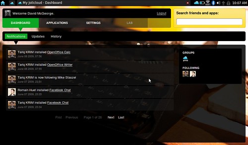
Jolicloud Dashboard

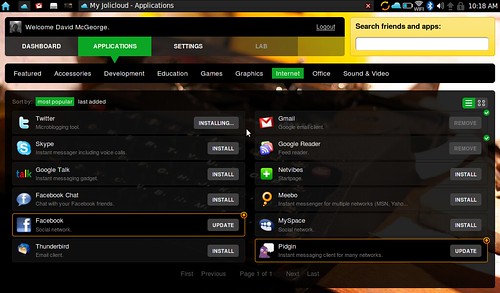
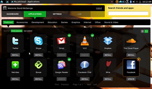
The main feature of Jolicloud is the Jolicloud interface (this is not the entire operating system, more like an application within the OS). Inside it has all of the aspects of a social network and an app directory. All of the apps here are very much netbook orientated. VLC, Twitter, GMail, Google Docs, Facebook, etc. Mostly apps running in the cloud.

App Directory


App Directory - Listview

I had a little issue at first not being able to install any of the web style apps. This was fixed with a quick visit to the updates tab. All in the name of alpha!

The social aspect of the OS comes in the form of a follow-me-and-I’ll-follow-you style of interaction. Giving you a dashboard full of “This person is following that person” and “This person has installed Skype”. It’s a great way to discover new people and apps.

From a user experience point of view, managing your apps and social stream is very straight forward and intuitive. Once you have installed your apps and made your friend connections you then leave the nice Jolicloud interface. This is where the nice slick design seems to trail off.

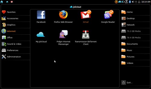
Launch Apps

At this stage, for me, you lose the nice intuitive interface when you are launching your apps. It seems a little disjointed especially if your have never used Ubuntu before.

I would like to see a boot straight into the Jolicloud interface and within this have app launching capabilities. After seeing some of the early screenshots I was expecting this interface to be the entire OS. A small gripe I know but the experience seems to change so much once you are out of the Jolicloud interface.

So is it any good, really?

Yes, it really is. The issues I have are very small, maybe even a little bit picky. Like the fact that the ‘Home’ icon and the ‘Jolicloud’ icons are the same colour and that the menu bar is very cluttered with icons of different shapes and colours. These can and will be fixed in later versions (I hope). I’m trying to be a little more objective and look at the great stuff Jolicloud is actually providing.

Overall it’s a success and I’m looking forward to seeing what will come of this project in the future. It’s free but it’s looks expensive. It’s slick and it’s fast. It WILL be my netbook OS of choice when its released. Come on, you didn’t expected me to stay with windows XP, did you?
Usability in the Amazon

Tuesday, April 21st, 2009

Amazon's Usability

Amazon.com is one of the biggest and probably the best known of all online e-commerce shops. It was launched way back in 1995. It sustained the first internet boom and survived its following bust. It played a big hand in promoting the benefits of online shopping and is still most peoples first online shopping experience. I know it was mine (Gleaming the Cube on VHS… what. Its awesome!)

I believe that, not all but the majority of Amazon’s success has been down to its user experience and usability. It was one of the first internet shops to take usability seriously, and to my knowledge, the first to do full usability testing on a website.

Lets see what they did right.

For a closer look check out the slideshow above. Click ‘Full Screen’ for a massive view.

1999 (party like its…)

1999This is the earliest screenshot I have and by this time things have moved along well for Amazon. No longer did they only sell books, now a whole manor of departments are listed. The first thing that stands out is that the logo is not in the standard top left corner. The left navigation is a waterfall of links and text. A little difficult to read I think.

2000 (Lets all meet up in the year…)

2000 Now everything has gone haywire and they have departments coming out of their ears. This is a good example of how top horizontal navigation does not grow well with a website. I suppose its still usable in this form but it looks terrible.

2001 a space odyssey

2001a The top navigation had to be tamed. A victim of their own expansion. Too many departments forced them to only show a few departments with a “see more stores” link. The left navigation has also been brought a little more inline. It doesn’t hurt the eyes anymore.

2001b The colour change could have been a seasonal change but the more important usability change is that the left navigation is no longer in alphabetical order. When you have a lot of departments alphabetising the navigation is often a good way to help the user. On the other hand, if 80% of your visitors use only a handful of departments you are helping them enormously by ordering departments by popularity.

2002 (No song or film has 2002 in the title)

2002 Why change a winning formula? More of the same apart from a slight tweak to the left navigation. It is now far more usable with just a touch of organisation and section heading. Users don’t read anything online (in most cases). If you can make content easy to skim users will love you for it.

2006.

2006a A drastic redesign is required now that Amazon has 32 stores to fit in. Why the logo was put inside a tab, I will never know. Don’t mess with the convention of a logo as the home link situated at the top of the page.

With the department overload, a new ‘favourite department’ functionality has been shoehorned in. This will do nothing for usability and I would be surprised if any user would take the time to customise the navigation of an online shop. Would you?

2006b Hurray the search is back. I have no idea why they would remove such an important usability and navigation aid from the framework of the website. Its not a win win situation because they also added an Amazon A9 search box. This searches the web but looks just like a regular internal site search. Even with the title ‘web search’ I still paused and had to think. (We all know that’s bad idea don’t we Steve Krug).

2007.

2007a The year of the product. No massive changes to usability but a style change to the way products are displayed. Less text gives it a cleaner look whilst the carrousel product spinner gets a lot more items on the page but doesn’t clutter (much). Amazon now has a list of 43 product categories to view. Just imagine if they had continued with their original tab layout.

2007b Not long after their previous radical change, along came another monumental realignment. The issues with hiding departments behind a “See all 43 Product Categories” tab must be apparent now. The traditional top navigation has been replaced by something that is very similar to the current version of the website. And finally… the logo is back in the most usable and conventional position.

2009.

2009 The current day Amazon. The top navigation is slowly creeping back but now its only used for account related information. A very successful usability technique is to keep similar functioning pages in the same area. This is a good example. The left navigation has now been compacted to its main headings. New web technologies and the widespread adoption of rollover drop down menus have made it possible for this approach. This left navigation is no longer a daunting expanse of links. Its now a little cleaner and more usable.

What’s next?

Looking at the massive differences from the 1999 screenshots to 2009 version, you can see that things change a lot. I wonder if amazon ever thought they would sell so many products in as many departments? Nobody can predict what their e-commerse shop will turn into and how many products will be sold. All you can be sure of is that every addition you make could require some change in usability. Usability is not something that’s undertaken once and its done. It needs to change and adapt with your shop. A usability evolution over time.


Go to the top of the page Web design blogs