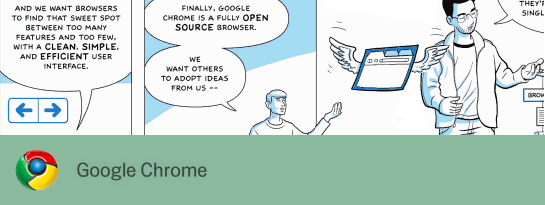
You have read comic of never-ending proportions, you have listened to the monster of hype that surrounds it, but one thing that is never really mentioned…
Is it any good for web designers… really?
Chrome is a new web browser from that little startup a few years ago called Google (stupid name it will never last, its not even a word!). First and foremost I will rant about the fact that their is no version for the mac. I have been testing it mostly through VMware Fusion so not a massive downer but I would prefer it to be native.
Two days ago I quit Safari and Firefox then made Chrome my browser of choice. All main development and browsing was done though this browser. Before I delve into the depths of why it helps or hinders the web design process I think I need to run through some of its features.
Features that are useful for web design
 I spend far too much time with my hands on the keyboard to worry about the mouse. Shortcuts keys are productivity gold. In a very OS friendly way Google Chrome keeps to the conventions and goes with what you would expect. Unlike other big name companies, yes Adobe Photoshop on the Mac I am talking to you.
Ctrl+L – Gives focus to the address bar.
Ctrl+T – New tab, my most used shortcut.
Ctrl+U – View the page source.
Ctrl+F – Find.
Ctrl+Click a link – Opens the link in a new tab.
Alt+Click a link – Allows you to download the contents of the link.
The view source has code highlighting and line numbering. The links inside the source are clickable, again a great time saver.
Google Chrome has no status bar running along the bottom of the browser to take up precious web design real estate. When you rollover a link it pops up a small bar in this area. Its only visible when its needed. A few more pixels available for that unnecessarily large footer.
 Dragging links from the page to make a new tab is all very cool but you can also do this with images. Great for testing and just that little bit fast than having to open the inspector every time.
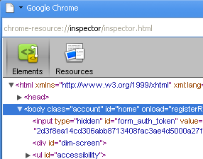
Well that was a good list of features… I seem to be missing the main one. Oh yeah, because the browser is based on the Webkit rendering engine you get the super inspector. Simply right click on any element and get a barrage of helpful info from it like css/html. Its no Firebug but for a built in feature its a great addition.
A feature not so well publicised is the advanced memory page. Type ‘about:memory’ into the location bar and you get a better breakdown of the memory consumption plus it also shows you the memory of other browser too. A nice comparison but not massively useful for a web designer.
Incognito tab or porn mode
Yeah! I can now surf anonymously without any digital trail being left behind for any unsuspecting third party to see what kind of a deviant double life I lead. Apart from the added perk of my partner not discovering my hula hoop fetish the incognito tab is actually a fantastic tool for testing.
At BigRedCircle we build a lot of web apps as well and web sites. One thing that is needed often is to test these apps from the perspective of a new user. With the incognito tab open I can log into a web app using completely different user details and nothing is stored so my session in the regular tab is safe. This is a massive time saver and annoyance saver. No need to delete all of my browser cookies just for a quick test.
Not another browser to test in!
Great, another browser to take into consideration! The bain of a web designers existence. Chrome uses the Webkit rendering engine so if you have built a site and it works in Safari 3 then it will almost certainly look the same in Chrome. This doesn’t mean you shouldn’t check it in Chrome but I don’t ever see a need to have some crazy css hack to target this browser.
Is Chrome my weapon of choice in this armoire of web weapons?
No! But it is good. The best kind of browser is a fast one and Chrome sure is fast. As far as the browsers go it ticks a lot of the boxes but will it replace Firefox as my own personal development browser of choice? If the Web Developer Tool Bar and Firebug were available for Chrome it would. Again Firefox has become better than the sum of its parts and takes the lead but only by a whisker.
Although Google keep telling us that this is just the first Beta, maybe “we ain’t seen nothing yet”.


 I spend far too much time with my hands on the keyboard to worry about the mouse. Shortcuts keys are productivity gold. In a very OS friendly way Google Chrome keeps to the conventions and goes with what you would expect. Unlike other big name companies, yes Adobe Photoshop on the Mac I am talking to you.
 Dragging links from the page to make a new tab is all very cool but you can also do this with images. Great for testing and just that little bit fast than having to open the inspector every time.



 The highlight for me was