Blog - Web design Leeds, Big Red Circle we do web design and web applications

Big Red Circle web design blog

Portfolio – Pentaplexity, our latest website

July 17th, 2008

We have been working on a website called pentaplexity.com, it was made to promote and sell a super difficult puzzle game. Have a look and see if you can figure it out. We know we can’t.

Images of Pentaplexity logo

What do you think of the sliding home page? I think it looks like it should make the noise of a well oiled pulley system. How about you?

Pentaplexity Promo Site

Look! It’s moving. It’s alive. It’s alive… ppppost is live

July 4th, 2008

Oh, in the name of God! Now I know what it feels like to be God! I stood back as I laid my eyes on for the first time what seemed to be…

An awesome looking web app! Yes its true, the long awaited (long awaited to a short queue of people) ppppost.com is now live and free for anyone to have a go. Frankenstein references aside, it has been a difficult day or two. I did actually launch it yesterday, but was then forced to withdraw it within ten minutes later. That was not good for the nerves. All of those original problem have been fixed and now its ready for public consumption. Let hope we haven’t created a monster, and it won’t destroy us either.

I need you

Now its up and functional, but by no means completed. We want you to have a play with it and tell us what you think. Test it out see how you enjoy the experience. Do you like the colours? Would you change how it works? You can suggest networks for use to add. All ideas, comments and criticisms are welcome. Comment away.

Is that it then! are you done?

No we are not finished, we just had the idea of getting it in front of the public’s all seeing eye as fast as we could. We want to get peoples opinions because we are not the only people using it and we don’t want to force our ideas on everyone without them letting us know if its good or not.

We are looking into more API’s and different social networks to add to ppppost, seeing what are the most useful and used networks around. We are looking at Plurk so this could be popping up soon.

We are refining the backend almost everyday and making it that little bit more efficient. The user experience is very important too and we are tweeking that as we go, nobody want a super app that nobody can use or an app that nobody enjoys using.

What are you waiting for PPPPOST.COM

Your social network helper ppppost

July 1st, 2008

And now it has a name… doesn’t it make you feel better about it now that you know it has a name.

Previously we decided to create a web app in 5 days which was code-named ‘Project SmallGreenTriangle’. Now it has its own name, its called ppppost. The name possibly gives a little more away about what the app will do. The graphic above is a representation of the style of the site. What do you think?

After a fairly chaotic week of client requests, website emergencies and iChat silly face games we finally got some time to work on ppppost.

We will launch ppppost as soon as it is functional (which wont be long, I promise!). This way we can get you, yes you, the user to give us feedback. In turn we will change, update, alter and add things from your suggestions. Everyone’s a winner.

It has been named. It has a proper URL. All that is left for us to do is get the thing live.

…and hope that Carsonifed’s new matt project is not the same :)

Project SmallGreenTriangle

June 20th, 2008

Over this last week here at BigRedCircle we have taken a slight step back from our usual web design work and are embarking on a little inter office project. We spend most of our time making websites for clients, which is great but to keep everyone from slipping into the day to day monotony spiral we decided to mix it up and create something for ourselves (and the rest of the internet).

Pritt StickWe came up with an idea, lets call it “Project SmallGreenTriangle”. It had to be quick and it had to be useful. We all use twitter, pownce, facebook etc (a little too much somtimes) and without giving too much away we are making something that will help you out with all of your many social networks. It will be a web app and it will be free!

We started on Monday, it was going to be a “Web App in 5 Days!” and the post you are reading now should be a “Hey check out the new BigRedCircle web app” but in fact the sum total of hours spent on “Project SmallGreenTriangle” is a massive 13.5.

Unfortunately more pressing client work has had to take over and slightly stifled the progress of “Project SmallGreenTriangle”, we are still in the felt tipping and Pritt Sticking phase.

Our aim is to get the project up and live for people to see, mess with and test as soon as it is functional. This way we can mould its development and direction to the people who are using it based on comments and suggestions we get. Power to the people.

Keep one eye on the Circle and check back soon.

A Surfer in the Waves of Social Aggregation

June 3rd, 2008

Social aggregators – who are they, what are they and what do they want?

They want to eat your social network profiles and they are hungry. SocialThing! is an aggregator that helps speed up the process of checking every last social network you have signed up to in one easy to use web app.

What’s the problem anyway?

So you have joined 101 of the coolest social networking websites that have come out in the last two weeks in a vain attempt at pretending that you have more friends than you actually do. Wait, there is a problem…! It just took me until lunch time to check all of my social goings-on.

Let me paint you a picture with my imagination brush:

You get to work, your boss is on your back, he is all like “hey I want that spreadsheet ASAP”, you are all like “Ok, right away sir” whilst flipping the bird from behind your monitor in a child like passive aggressive fight the power kinda way.

You then have to check your emails and make that all important cup of coffee to pep you up for a day of servitude and mundane data input. You have to check your all important social networks to remind yourself that you have a life outside of work. Herein lies the problem! You don’t have time to sit there until 11:30 just to find out that the guy who used to give you wedgies at school has just added 20 new photos to “Bozza’s piss up in Faliraki”. What you do need is SocialThing!

Social Networks… not another one

Its ok, its not a social network don’t hit that close button just yet. Its a social network helping hand. A social network friend who helps carry your shopping from the car into the house. It combines all of your social profiles into one web app using a “river of information” style view.
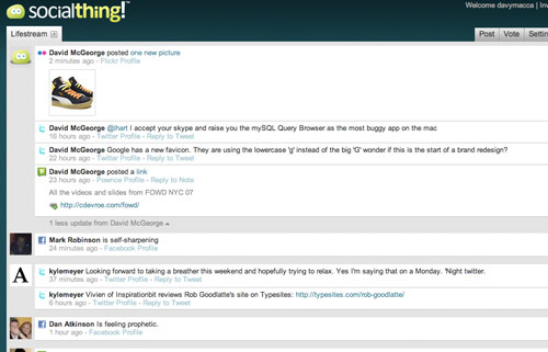
As its relatively new only a few networks are available but as I mainly use pownce, facebook, twitter, flickr and a few others SocialThing serves me well. You can vote for other networks that you want on.

When you are presented with your wave of social activity those annoying people who twitter 20 times every hour are grouped together so they don’t monopolise your social pleasure. If you follow people on different socials networks, say you have the same friend who is on pownce and twitter it puts all their activity nicely together cross network.
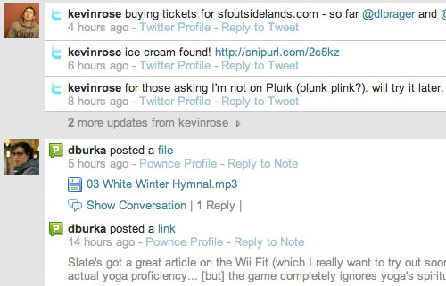
The main interface is ordered by time so you can quickly see whats been happening in the last 24 hours across multiple networks in one click on one website. Simplicity personified.

Everything has its problems

There are a few other features that fade into insignificance against the main function of the app, like being able to post to more than one network at a time.

Reliability is an issue too. I had to reload SocialThing 8 times to get a screen shot which had pownce working. I hope these are all teething problems because a service as good as this one could be brought to its knees with stupid niggly issues like this. Social spam and network availability aside its a good little package.

One side effect I did not expect from SocialThing is that I ended up using my social networks more. My initial thoughts were “yeh I can see them all, will never bother going to the actual website again”. The RSS syndrome, where you only read a sites content in your RSS reader but never actually go to it. The reality of it was quite the opposite. Points lost to my productivity.

Private beta nightmare

Why launch a product if you don’t want anyone to use it. Well I know you all think it so I went and said it. I do know that there are many reasons to do this. A lot of the time it’s valid but it does frustrate me… I want to play with that new thing!

With the kind of problems twitter has been having lately I would hope that new super social sites have got there scaling and redundancy in order before they meet critical mass and steam roll there hosting companies into the ground. So private betas are ok, I suppose.

I have some beta invites if anyone needs one, drop me a tweet or a pownce or a comment or contact me in any other social way possible and I will hook you up.

Go Forth and socialise.


Update 20/06/08

SocialThing 2.0 has been release and it looks very nice. They have overhauled the interface and added a few new networks and features. Still a little slow at times! Let me know what you think of it.

Portfolio – Nouveaux website has launched

May 26th, 2008

Finally the new Nouveaux Online website has gone live for everyone on the internet to see. After the usual rigmarole of cross browser testing and getting the right content from the client we have finally launched the (and I quote) ‘Best Conservatory website in Liverpool’.

It has lots of funky new features but our favourite is the new online quote generator. I haven’t seen any other conservatory websites with anything like this on it. So, like captain planet we combined all of our usability powers and gave you the easiest online conservatory quote generator known to man.

Have a look around, even get a quote?

Portfolio – Nouveaux Online

See how fast you can get a quote. Maybe not the best use of the website but from the page loading to seeing a price my best time was 11.2 seconds.

RSS readers never looked so good

May 11th, 2008

Times RSS reader

Morning Ritual

I get up. Have a cup of green tea. Breakfast. Check my emails. Then get down and dirty with my RSS reader full of 1000+ new pieces of the internet.

This is something I do every morning, it makes me happy. What do I need to make this happen? An RSS reader. Why am I telling you this? I have found something new.

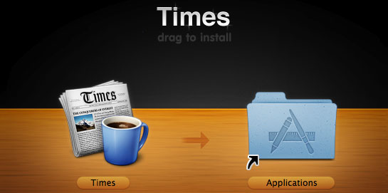
Times from Acrylic

For the last year or so I have been into RSS feeds in a big way and almost everyday I use Google Reader to get my fix. For the last week I have been using something else. Something different, something unique, something strange but not unpleasant.

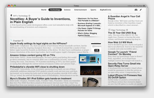
Times screen shot

As you can see Times is not your usual list/email style of feed reader. It presents you with an interface non too dissimilar to a newspaper. It has been exquisitely crafted and integrates well with OSX. Considering all of the information is dynamic and from different sources the visual layout is captivating and slick.

“Its the best non-newspaper I have ever read”

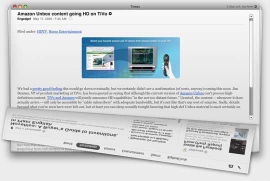
Once my initial ooh’s and arrr’s had died down from the main page I clicked on a story… Like a child at a fireworks display my ooh’s and arrr’s returned. Times uses OSX’s Core Animation to literally peel back the page and reveal the whole story. It felt as natural as flicking through a real newspaper. Well, as natural as a computer simulation of such an activity can be.

Screen Shot - Open a story

When you fire up Times for the first time its filled with all of your common or garden feeds. Now this is where the magic happens – its fully customisable! Import all the feeds that you know and love directly from Mail or Safari. Or go it old school and add the url by hand.

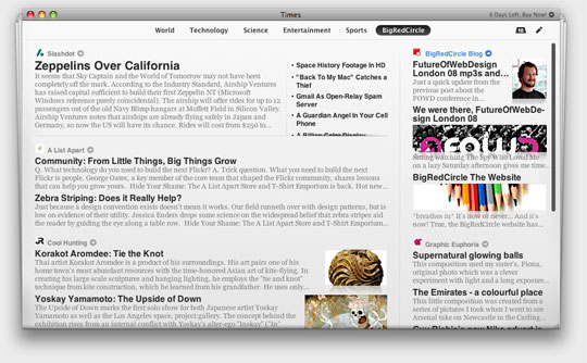
In less time that it takes Doc Brown to explain the concept of an alternative 1985 I made and configured a bespoke BigRedCircle page with all the feeds I love. Like this:

Screen Shot - Custom page

It’s almost too easy!

In this world of “everything for free on the internet” why would I pay?

Yes Times is a desktop application that costs $30, or it did the last time I looked. This is the kind of money that I could be spending or an over hyped summer blockbuster DVD. Why should I deprive myself of such mediocre dialogue and high octane action?

Bring the Noise!

Google Reader can help me scoff through 200 bits of RSS shaped cake in less than 5 minutes. This is its beauty. This is also where the beauty stops. With Times I tend to read every story in every feed I subscribe to.

I very rarely buy newspapers anymore, but if I am going on a long train journey I will buy a paper from the station and read it cover to cover. Times has this effect on me too.

It gives me more of an experience. Not just a quick way to get info from all corners of the internet. Although this has its shortcomings. I don’t get any work done whilst I am digesting every morsel of today’s Lifehacker stories or finding out every single new (depressing) 3G iPhone rumour.

My 14 day trial is coming to an end

Times iconWhat do I do now? Should I throw some hard earned cash at it and purchase RSS designer chic. Unfortunately no! Although I do love what they have done. Reading RSS feeds can be an experience too and Times makes it a very pleasant one.

I still can’t take myself away from the wonders that is Google Reader. I have a small but active Google Reader friend base who share their stories. Times doesn’t come with a pre configured social network. When I get up in the morning I need to get my web designer hat on as quickly as possible, Google Reader is simply the most efficient way to do this.

The last of nails to be put in this Times shaped coffin is that fact that I do a good percentage of my feed reading on my iPhone. I want my information everywhere, on any computer, any device. A desktop RSS reader is just not the way to go for this. This is not a problem with Times its a task that online RSS readers can simply do better.

If I had the Time I would use Times! Unfortunately I don’t

Check it out yourself, take a week to revel in the uber slick animation and see if you will switch. If Google Reader didn’t exists maybe I would be using Times right now.

FutureOfWebDesign London 08 mp3s and keynotes

April 29th, 2008

Just a quick update from the previous post about the FOWD conference in London.

Those people over at Carsonified have released all of their speakers talks on mp3 and put their keynotes on slideshare. Isn’t that that nice of them.

If you listen to the mp3 and flick through the slides at the same time. It’s like your own personal ‘FOWD at my desk’ conference.

I highly recommend you stop what you are doing and listen to these now, well if you want to.

Some of the best talks in no particular order


Andy Clarke & Steve PearceMP3 Keynote

Jon HicksMP3 Keynote

Daniel BurkaMP3 Keynote

We were there, FutureOfWebDesign London 08

April 21st, 2008

Sitting watching The Spy Who Loved Me on a lazy Saturday afternoon gives me time for quiet reflection of my previous week. Why don’t all cars come with submarine mode capabilities? It would make for much more interesting trips to Blackpool. Putting aside my desire for a sub-aquatic Lotus Esprit I though I would share with you the best thing that has happened this week…

BigRedCircle went to the Future of Web Design 08 conference in London!

With all the excitement of visiting an underwater base we stepped into Kensington town hall.

This was, personally my second visit to the hall of web wonderment. So, how did it match up to last year?

FOWD07 – I left feeling inspired and hungry for my next web project. Millions of ideas and possibilities were circling around my head. Some of which made it to the web, others are still waiting to be great. Although I think I missed a trick with my amazing idea of selling fresh bread online. I think 2010 will be the year of bread online. Just you wait!

FOWD08 – To compare the two is a difficult thing to do. Its like comparing jasmine green tea with pineapple and grapefruit green tea. They are very similar in many ways but inherently different.

This year I actually learned a lot. The conference seemed slightly more technical, aimed a little more towards developers as oppose to straight up designers.

This was like cat nip to me.

Hicksdesign gave an innovative talk on his development process from start to finish on a website that I can safely say is best cheese website in the world ever. cheesophile.com

The highlight for me was Andy Clarke and Steve Pearce’s tag team, duel blow, double dragon attack on the “User Experience vs Brand Experience” subject. Simply inspiring and really made me think in new ways when I approach such a subject. Inevitably, the outcome was: The two should not be at opposite sides of the ring in a death match style but more naturally be married together in a harmonious way. Expertly depicted and voiced by these two web guys on top form.

Top of the bill, king of the castle, the headlining act… Daniel Burka gave a good insight into the trials and tribulations of developing a webapp from an in-house capacity. Its one thing to create websites in a creative design agency. Always jumping from site to site, but to keep your focus and reiterate and reiterate over and over, always trying to improve a single webapp that is used my millions. A daunting task. The talk was very impressive, I almost felt like whooping. Being an american I think he would have appreciated a significant whoop during his talk but I resisted and bowed to my better judgement and simply clapped a little harder at the end.

All in all I can’t fault the Carsonified guys for putting on such a top notch, blog worthy event. Thanks, from all at BigRedCircle. The fire in our bellies has been truly stocked, the magic wand of inspiration has been waved over our heads.

To the information super highway!

BigRedCircle The Website

April 15th, 2008

BigRedCircle Pencils

*breathes in*

It’s now or never… And it’s now!

True, the BigRedCircle website has finally launched.

*breathes out*

It’s been a long time coming so, sorry, but thanks to those who just kept on waiting. It’s well worth it, honest.

After deciding not to be a hula hoop manufacturer, we’ve come to terms with the fact that we are a web design agency. In Leeds.

At BigRedCircle we just love to make nice looking things that go on the internet. So that’s what we do – every day. But nice looking things are nothing if they don’t work very well, not on the internet at least.

That’s why our forte is intuitive usability for the web apps we make. That’s where most of our brain power goes. And that’s why we’re good at it.

Sometimes we sleepwork – but mostly we just work. Often without sleeping.

And like the geeks we are, we do actually love our jobs.

It’s like Confucius said: “Choose a job you love and you’ll never work a day in your life.”

So it’s all good.

We don’t have windows in our office so this BigRedCircle blog is us getting some sun in from the internet world and looking out for a few opinions along the way.

It’ll be much for many but mostly it’ll be sizzling hot behind the scenes stuff from right here at BigRedCircle. You know, trade secrets, proving conspiracy theories, scrabble high scores. The norm.

We love to share. Someone once reckoned that sharing is caring. We tried it, it’s true. So expect a lot of caring going on round here.

We’re talking free open source code snippets, php or javascript class here and there. Plus what’s hot, what’s not and just things that generally make us smile.

Right then, we’ve sharpened the HB’s, zipped up the pencil cases and put the lids back on our felt tips. Nothing left to do but some more work.

Enjoy :)

David McGeorge
Director


Go to the top of the page Web design blogs